Introduction
Design Objectives
The new brand system establishes the visual identity for IEMHP, a non-profit under SickKids Hospital, to ensure consistent branding across all communication channels while respecting SickKids' corporate guidelines.
Align with SickKids’ branding for cohesion.
Reflect IEMHP's values of inclusion, diversity, and accessibility.
Create a distinct identity that communicates expertise in early mental health.
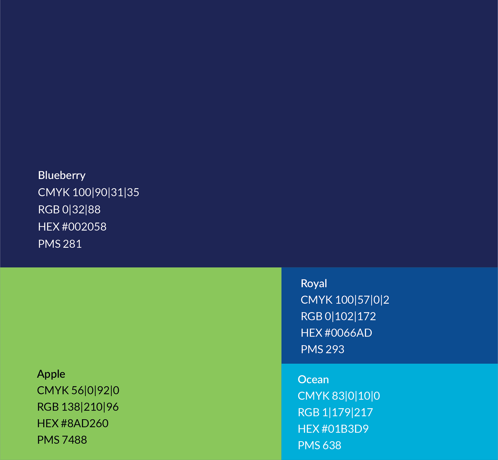
Brand Colors
Primary Colors
1. Blueberry (#002058): The foundation of IEMHP’s identity, symbolizing trust, stability, and professionalism.
2. Apple (#8AD260): A vibrant green representing growth, health, and mental well-being.
Secondary Colors
1. Royal (#0066AD): Derived from SickKids’ palette, used to reinforce brand alignment.
2. Ocean (#01B3D9): A refreshing blue hue conveying approachability and innovation.
Iconography Redesign
The redesigned icons for the IEMHP homepage use a clean, unified style with Blueberry (#002058) and Apple (#8AD260) to ensure brand consistency, accessibility, and scalability across all applications.


Collaboration Inclusion, Diversity & Equity Integrity Quality & Innovation Sustainability
Visual Branding System Application
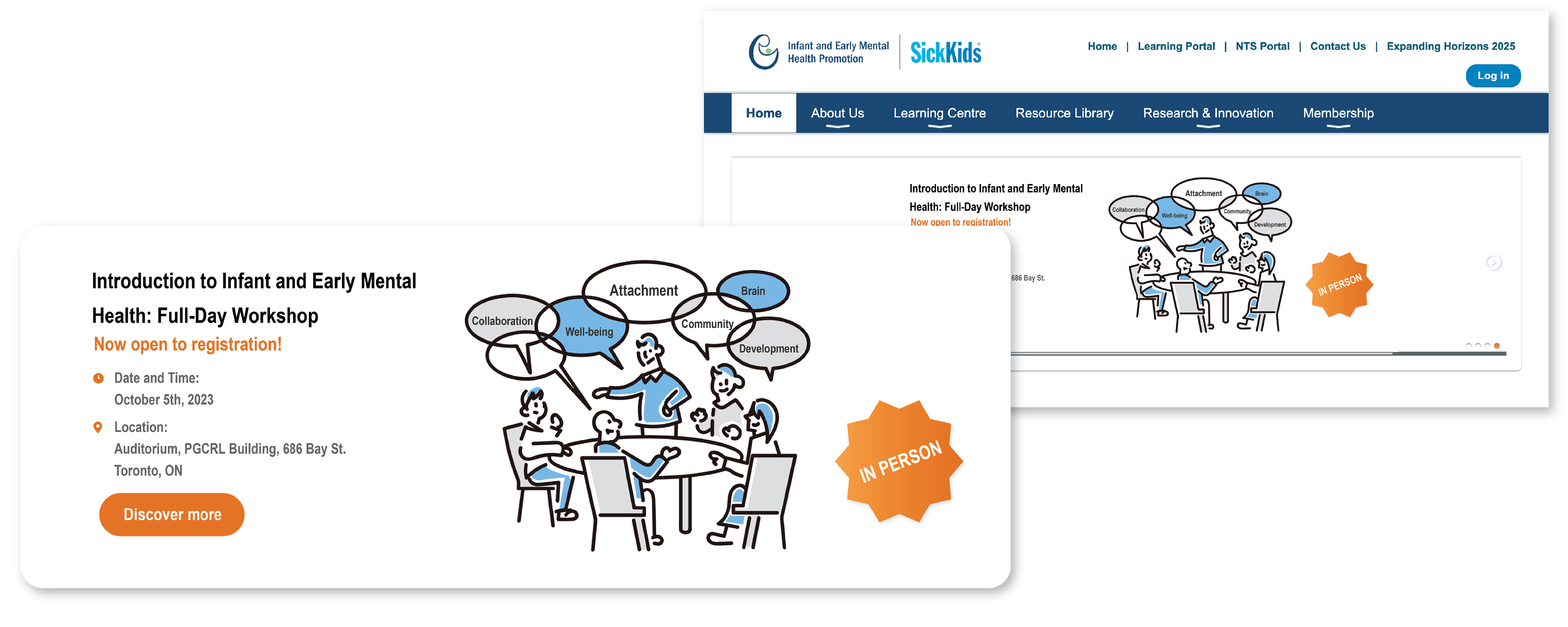
The banner illustration design utilizes Royal (#0066AD) as the primary color, with a clean and modern style. The illustration elements depict a multi-person meeting through overlapping circular tables, diverse figures in seated postures, and collaborative gestures, emphasizing inclusivity and engagement.
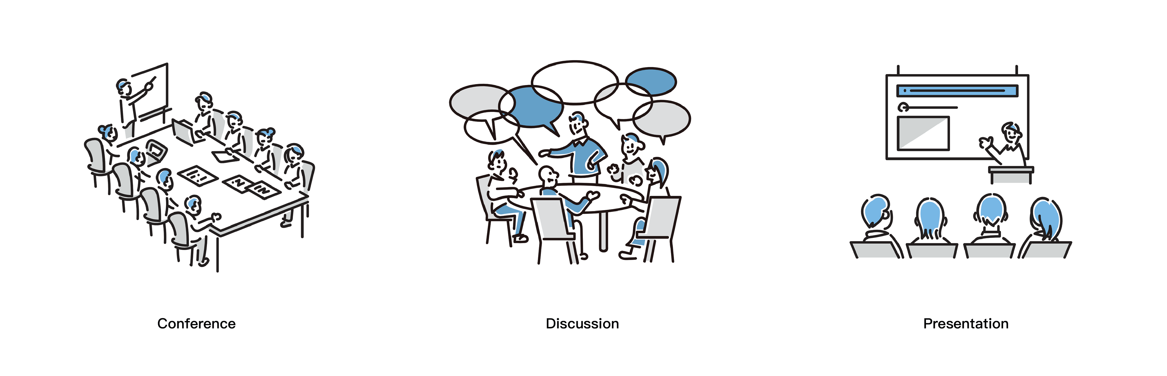
Banner Design